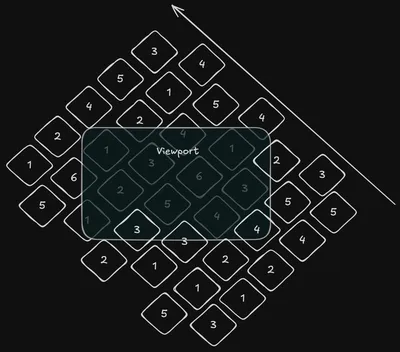
In this post, I’ll walk through how I built the infinite scrolling tech stack showcase featured on my portfolio’s homepage. This effect was achieved using Tailwind CSS, relying almost entirely on its utility classes.
Note: I’m using the new 4.0 version of Tailwind CSS.
Requirements Gathering
When I started rebuilding my portfolio in early 2025, I envisioned a dynamic way to showcase the libraries, frameworks, and languages I’ve worked with. I wanted a smooth, animated scroll effect that would continuously display what I’ve used throughout my career.
I wanted this section to serve as a quick glance into my expertise. Rather than a static grid of logos, the scrolling effect would add some unique motion and hopefully grab my visitor’s attention.

Let’s break down the requirements:
- We need a collection of tiles in a grid
- Each tile needs to have a logo corresponding to something I’ve worked with professionally
- The tiles need to be rotated to provide a nice 3D effect
- The tiles need to be clickable and direct the user to a URL
- Each row of tiles needs to be offset from eachother
- The tiles need to be animated to appear to scroll through a viewport
- The scrolling needs to appear to go on infinitely
- When the user hovers over the viewport, the scrolling needs to pause
Separately, for my own growth, I wanted to see if I could create this entirely in Tailwind CSS.
…ok that’s a serious list of requirements, let’s get to work!
The Tile
To start. We need to make ourselves a button. I really like Josh Comeau’s Building a Magical 3D Button as a starting point. It uses standard CSS classes, so now seems like as good a time as any to dip our feet into converting components to use tailwind classes.
type LogoButtonProps = {
	label: string;
	src: string;
	backgroundColor: string;
	url: string;
};

export const LogoButton = ({
	label,
	src,
	backgroundColor,
	url,
}: LogoButtonProps) => (
	<div
		className={cn(
			"group/button padding-0 relative cursor-pointer border-0",
			"bg-transparent outline-offset-4 hover:brightness-110",
			"focus:not-[:focus-visible]!outline-none",
			"transition-[filter]",
			"h-40 w-40",
		)}
	>
		<span
			className={cn(
				"absolute top-0 left-0 translate-y-1 rounded-xl will-change-transform",
				"h-full w-full bg-black opacity-25",
				"transition-transform ease-in-out",
				"group-hover/button:translate-y-2",
				"group-active/button:translate-y-0.5",
			)}
		/>
		<span
			className={cn(
				"absolute top-0 left-0 h-full w-full rounded-xl brightness-50",
			)}
			style={{ backgroundColor }}
		/>
		<a
			href={url}
			target="_blank"
			className={cn(
				"flex flex-col items-center justify-center p-8 select-none",
				"h-full w-full -translate-y-2 rounded-xl will-change-transform",
				"transition-transform ease-in-out",
				"group-hover/button:-translate-y-4",
				"group-active/button:-translate-y-0.5 group-active/button:duration-75",
			)}
			style={{ backgroundColor }}
		>
			<div className="flex grow justify-center">
				<img src={src} width={100} height={100} alt={`${label} logo`} />
			</div>
			<span
				className="text-primary shrink text-3xl"
				style={{ color: "hsl(0 0% 98%)" }}
			>
				{label}
			</span>
		</a>
	</div>
);
Ok that’s a lot of code. What’s going on here? Let’s break down the Tailwind CSS classes used in this component and understand their effects.
Top-Level <div> (Wrapper)
<div
	className={cn(
		"group/button padding-0 relative cursor-pointer border-0",
		"bg-transparent outline-offset-4 hover:brightness-110",
		"focus:not-[:focus-visible]!outline-none",
		"transition-[filter]",
		"h-40 w-40",
	)}
>
What These Classes Do:
group/button: Creates a “group” context for child elements. Child elements can referencegroup-hover/buttonandgroup-active/buttonto react to interactions with this div.padding-0: Ensures no internal padding.relative: Establishes a positioning context for absolutely positioned child elements.cursor-pointer: Changes the cursor to a pointer on hover, indicating interactivity.border-0: Removes any default borders.bg-transparent: Makes the background fully transparent.outline-offset-4: Pushes the focus outline 4px away from the element.hover:brightness-110: Slightly increases brightness when the user hovers over the button.focus:not-[:focus-visible]!outline-none: Prevents an outline unless the user navigates via keyboard (focus-visible).transition-[filter]: Smoothly animates any filter changes (like brightness on hover).h-40 w-40: Sets the button’s dimensions to 40 Tailwind units (160px × 160px).
Feel free to adjust the width and height however you like!
First <span> (Shadow Layer)
<span
	className={cn(
		"absolute top-0 left-0 translate-y-1 rounded-xl will-change-transform",
		"h-full w-full bg-black opacity-25",
		"transition-transform ease-in-out",
		"group-hover/button:translate-y-2",
		"group-active/button:translate-y-0.5",
	)}
/>
Purpose: This creates a subtle shadow effect that moves when hovered or clicked. What These Classes Do:
absolute top-0 left-0: Positions the shadow exactly on top of the parent div.translate-y-1: Moves it down slightly by 4px.rounded-xl: Gives it rounded corners.will-change-transform: Optimizes animations for performance.h-full w-full: Ensures it covers the full button area.bg-black opacity-25: A black overlay at 25% opacity.transition-transform ease-in-out: Animates movement smoothly.group-hover/button:translate-y-2: Moves the shadow down further (8px) when hovered.group-active/button:translate-y-0.5: Moves it slightly up (2px) when clicked.
Second <span> (Background Layer)
<span
	className={cn(
		"absolute top-0 left-0 h-full w-full rounded-xl brightness-50",
	)}
	style={{ backgroundColor }}
/>
Purpose: This serves as the main button background. What These Classes Do:
absolute top-0 left-0: Covers the full parent.h-full w-full: Full size.rounded-xl: Rounded corners.brightness-50: Makes the background darker.style={{ backgroundColor }}: Dynamically applies the button’s background color.
<a> (The Top of the Button)
<a
	href={url}
	target="_blank"
	className={cn(
		"flex flex-col items-center justify-center p-8 select-none",
		"h-full w-full -translate-y-2 rounded-xl will-change-transform",
		"transition-transform ease-in-out",
		"group-hover/button:-translate-y-4",
		"group-active/button:-translate-y-0.5 group-active/button:duration-75",
	)}
	style={{ backgroundColor }}
>
Purpose: This is the interactive content inside the button. What These Classes Do:
flex flex-col items-center justify-center: Centers children (image + text) in a column layout.p-8: Adds 32px of padding inside the button.select-none: Prevents text selection.h-full w-full: Ensures full coverage.-translate-y-2: Slightly lifts the content (8px) to create a 3D effect.rounded-xl: Matches the button’s rounded corners.will-change-transform: Optimizes animation performance.transition-transform ease-in-out: Animates movement smoothly.group-hover/button:-translate-y-4: Moves the content further up (16px) when hovered.group-active/button:-translate-y-0.5 group-active/button:duration-75: Quickly moves it down slightly when clicked.
Rows of Tiles
<div data-pagefind-ignore class="h-[600px] max-w-[600px] overflow-hidden">
	<div className="group/container flex w-[1200px] flex-col gap-6">
		<div className="flex flex-col gap-6">
			<div className="flex gap-6 odd:-translate-x-32">{/* Tiles */}</div>
			<div className="flex gap-6 odd:-translate-x-32">{/* Tiles */}</div>
			<div className="flex gap-6 odd:-translate-x-32">{/* Tiles */}</div>
		</div>
	</div>
</div>
The Animation
This is the one part that can’t be done with pure tailwind classnames. But, I’m able to still create the animation with CSS and use it with tailwind. To start, let’s make the CSS animation:
// global.css
@theme inline {
	--animate-move-up: move-up 30s linear infinite alternate;

	@keyframes move-up {
		0% {
			transform: translateY(0%);
		}

		100% {
			transform: translateY(-50%);
		}
	}
}
This simple animation:
- Starts at 0%: The element is in its initial position (translateY(0%) → no movement).
- Ends at 100%: The element moves up by 50% (translateY(-50%)).
Since translateY(-50%) moves the element upward, it creates an effect where our tiles will appear to scroll upwards over time.
Additionally, the animation has these parameters defined
move-up: Uses the keyframes defined above.30s: The animation takes 30 seconds to complete one full cycle.linear: Ensures a constant speed throughout the animation (no easing).infinite: The animation never stops.alternate: The animation reverses direction at each cycle:
Now lets apply it to our row container above. I also added a feature to pause the animations if the user hovers over the root container. This can be done using named tailwind groups. Named groups in Tailwind are a way to scope group behaviors to a specific parent. This allows us to have children be effected by their parent state - in this case pausing the animation in the child when the container is hovered.
<div className="group/container flex w-[1200px] flex-col gap-6">
<div className="group-hover/container:paused animate-move-up ..."The Rotation
Now for the easy part. Let’s add a rotation to the container:
<div className="group/container ... -rotate-x-50 -rotate-z-20 ...">-rotate-x-50
- Rotates the element around the X-axis by -50 degrees.
- The X-axis runs horizontally (left to right), so rotating around it tilts the element forward or backward.
- A negative value tilts the top of the element backward, making it appear as if it’s leaning away from the viewer.
-rotate-z-20
- Rotates the element around the Z-axis by -20 degrees.
- The Z-axis is perpendicular to the screen, so rotating around it spins the element clockwise (positive values) or counterclockwise (negative values).
- Here, -20 degrees means the element rotates slightly counterclockwise.
We also need to apply a negative top and left offset to account for the rotation, otherwise we’d end up with gaps at the start and left of our image.
<div className="group/container ... relative">
<div className="... absolute -left-[250px] -top-[150px]">Final Code
The final code for the animation is below. I really like how it turned out on the homepage. Happy coding!
type LogoButtonProps = {
	label: string;
	src: string;
	backgroundColor: string;
	url: string;
};

const LogoButton = ({
	label,
	src,
	backgroundColor,
	url,
}: LogoButtonProps) => (
	<div
		className={cn(
			"group/button padding-0 relative cursor-pointer border-0",
			"bg-transparent outline-offset-4 hover:brightness-110",
			"focus:not-[:focus-visible]!outline-none",
			"transition-[filter]",
			"h-40 w-40",
		)}
	>
		<span
			className={cn(
				"absolute top-0 left-0 translate-y-1 rounded-xl will-change-transform",
				"h-full w-full bg-black opacity-25",
				"transition-transform ease-in-out",
				"group-hover/button:translate-y-2",
				"group-active/button:translate-y-0.5",
			)}
		/>
		<span
			className={cn(
				"absolute top-0 left-0 h-full w-full rounded-xl brightness-50",
			)}
			style={{ backgroundColor }}
		/>
		<a
			href={url}
			target="_blank"
			className={cn(
				"relative flex flex-col items-center justify-center p-8 select-none",
				"h-full w-full -translate-y-2 rounded-xl will-change-transform",
				"transition-transform ease-in-out",
				"group-hover/button:-translate-y-4",
				"group-active/button:-translate-y-0.5 group-active/button:duration-75",
			)}
			style={{ backgroundColor }}
		>
			<div className="flex grow justify-center">
				<img src={src} width={100} height={100} alt={`${label} logo`} />
			</div>
			<span
				className="text-primary shrink text-3xl"
				style={{ color: "hsl(0 0% 98%)" }}
			>
				{label}
			</span>
		</a>
	</div>
);

const LogoRow = () => {
    const logosForRow = [/* Generate list of logo props */]
    return <div className="flex gap-6 odd:-translate-x-32">
        {logosForRow.map((logoProps, idx) => (
            <LogoButton
                key={idx}
                {...logoProps}
            />
        ))}
    </div>
}

{/* Adjust the viewport to your liking */}
const ScrollAnimation = () =>
    <div className="h-[600px] max-w-[600px] overflow-hidden">
        <div className="group/container flex w-[1200px] flex-col gap-6 -rotate-x-50 -rotate-z-20 relative">
            <div className="group-hover/container:paused absolute animate-move-up flex flex-col gap-6 -left-[250px] -top-[150px]">
                {/* Create as many rows as you need */}
                <LogoRow/>
                <LogoRow/>
                <LogoRow/>
            </div>
        </div>
    </div>
